This paper reexamines the Phillips and Beveridge curves to explain the inflation surge in the U.S. during the 2020s. We argue that the pre-surge consensus regarding both curves requires substantial revision. We propose that the Inverse-L (INV-L) New Keynesian Phillips Curve replace the standard New Keynesian Phillips Curve. The INV-L curve is piecewise-linear and more sensitive to labor market conditions when it crosses the Beveridge threshold — a point at which the labor market becomes excessively tight and enters a “labor shortage” regime. We introduce a modified Beveridge curve that features a near-vertical slope once the Beveridge threshold is passed, suggesting that in this region, adjustment in labor market tightness occurs almost exclusively through a drop in vacancies rather than an increase in unemployment. This feature matches the U.S. experience since the Federal Reserve’s tightening cycle began in March 2022. We also observe a similar pattern in the data during five other inflation surges over the past 111 years where the Beveridge threshold was breached. We define a Beveridge-threshold (BT) unemployment rate. Once unemployment falls below this rate, policymakers must be alert to sharp inflationary pressures from demand or supply shocks. We explore several policy implications.
The Phillips curve relates inflation to a measure of economic activity. At that time, empirical evidence suggested that the Phillips curve was very flat. A leading example is the work by Hazzell, Herreno, Nakamura, and Steinsson (2022), which found that a 2.9-percentage-point increase in unemployment resulted in only a one-percentage-point decrease in inflation. This led pessimists to argue that, to achieve its inflation target, the Federal Reserve would need to accept a substantial increase in unemployment.
The Beveridge curve describes the relationship between the intensity with which firms are looking for workers (job vacancies or v) and how many workers are looking for a job (the unemployed or u). The Beveridge curve is typically plotted as shown in Figure 2. A common metric of labor market tightness is the ratio v/u, a concept that dates back to Beveridge’s work in 1944.
If the Beveridge curve is flat, it indicates that cooling the labor market (reducing v/u) will inevitably result in significant unemployment. Drawing from several past episodes, authors such as Blanchard, Domash, and Summers (2022) adopted a pessimistic view in 2022, arguing that a substantial increase in unemployment would be necessary to cool the labor market and bring inflation back to target.

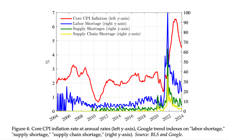

Figure 20 plots the job vacancy rate, calculated as the number of vacancies as a fraction of the labor force, and the unemployment rate, calculated as the number of unemployed individuals as a fraction of the labor force. The Beveridge threshold, v/u = 1, is shown with a dashed line. The data are monthly, sourced from the Job Openings and Labor Turnover Survey (JOLTS) of the U.S. Bureau of Labor Statistics (BLS), and cover the period from the survey’s start in December 2000 to the most recent observation.
We can identify five distinct periods, or “regimes,” each exhibiting unique dynamics. The first period, highlighted in red, extends from the start of the sample to the peak of unemployment during the financial crisis in October 2009. This period shows a stable pattern, resembling a curve that negatively correlates the vacancy rate with the unemployment rate.
Following the trough in October 2009, there was a continuous improvement in labor market conditions up to February 2020. This period also displayed a stable pattern but on a curve that was outwardly shifted compared to the previous period. Within this time frame, we have highlighted the points from January 2018 to February 2020 in blue, where the vacancy rate exceeded the unemployment rate and crossed the Beveridge threshold, just before COVID-19 and well before the inflation surge.
The blue period is followed by an abrupt shift due to the eruption of the COVID-19 pandemic, captured by the purple point on the far right of the graph, where the unemployment rate reached 15%. This fourth period is characterized by an irregular recovery in the labor market.
As emphasized in the last section, the final part of this recovery is marked by a tight labor market, with the job vacancy rate rising above the unemployment rate. This period is depicted with black dots, starting from May 2021. During this time, there is a steady decline in the unemployment rate and an increase in vacancies until the Federal Reserve begins raising rates in March 2022. Notably, the most recent points of decline align closely with the pre-COVID observations depicted in blue.
Should the sharp reduction in vacancies with little or no change in unemployment be surprising? One way to address this question is from a purely theoretical perspective, which we will explore shortly. However, it seems natural first to consider what can be learned from the other four inflationary surges of the past 111 years when the Beveridge threshold was crossed. Once the Beveridge threshold was breached, did the labor market adjust through an increase in unemployment or a reduction in vacancies? As we will see, a drop in labor market tightness driven by a reduction in vacancies, with little change in unemployment, is a pattern shared across these episodes, with the possible exception of the aftermath of WWI.
We conclude with two warnings. The first is that once the labor market crosses back over the Beveridge threshold so that v/u < 1, further reductions in inflation are likely to be more costly due to the flatness of the Phillips curve and the less steep Beveridge curve (and if the actual Beveridge threshold is higher, these costs will emerge even sooner). The second warning is that the Beveridge threshold may not yet have been reached. Much of the current reduction in inflation is in part due to the easing of supply shocks. With v/u still greater than 1, this suggests that adverse supply shocks could have significant effects on inflation.
Chosen excerpts by Job Market Monitor. Read the whole story Revisiting the Phillips and Beveridge Curves: Insights from the 2020s Inflation Surge | NBER


Discussion
No comments yet.