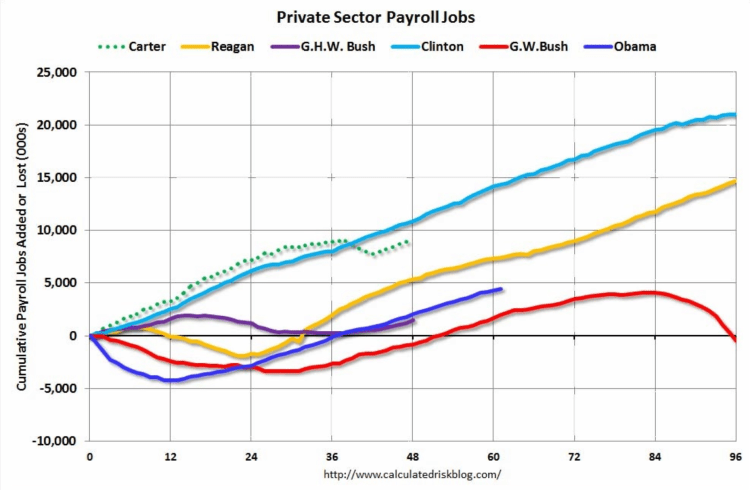
There are many differences between these periods. Overall employment was smaller in the ’80s, so a different comparison might be to look at the percentage change. Of course the participation rate was increasing in the ’80s (younger population and women joining the labor force), and the participation rate is declining now. But these graphs give an overview of employment changes.
Chosen excerpts by Job Market Monitor. Read the whole story at Calculated Risk: Public and Private Sector Payroll Jobs: Carter, Reagan, Bush, Clinton, Bush, Obama.
Related articles
- US / Job Creation Under The Last 5 Presidents
- US / Government-financed jobs account for more than 25 percent of nonfarm payroll jobs in seven states
- US / Why didn’t the severe weather put job growth in a deep freeze?
- The Job Gap in US / There are about 1.18 million fewer payroll jobs than before the recession started


Discussion
No comments yet.